The France Choropleth Map Excel Template allows you to create a map of France, broken down by regions, with each region colored according to how they rank against a specific metric. It is a highly effective method, that can be used for any given metric that you want.
The France Choropleth Map Excel Template allows you to create a map of France, broken down by regions, with each region colored according to how they rank against a specific metric. It is a highly effective method, that can be used for any given metric that you want.
Unlock powerful geographic insights with our France Choropleth Map Excel Template, the ideal solution for anyone struggling to visualize complex regional data. Create a dynamic, color-coded *choropleth map of France* directly in Excel with ease.
Whether you are an educator, researcher, or business analyst, this template transforms raw numbers into clear, interactive maps. Compare French regions on any metric and instantly see patterns and trends that drive informed decisions.
Built by Excel Wonders, this tool reflects years of data visualization expertise. Our intuitive layout and robust customization options ensure you get professional-grade results without complicated GIS software.
Trusted by data enthusiasts worldwide, the France Choropleth Map Excel Template makes reporting, presenting, and teaching more engaging. Start turning your datasets into meaningful stories today.
Features:
Sorry! No Reviews Yet!
At the moment, we don't have any reviews for the France Choropleth Map Excel Template.
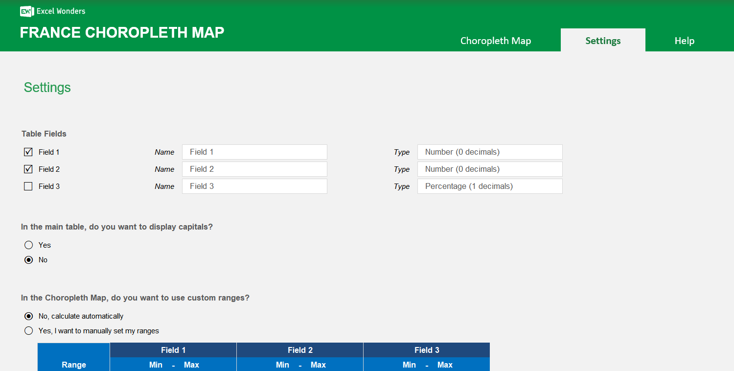
Yes. Both the region color scheme and the map background color can be changed in the "Settings" sheet. Use the provided dropdown menu and color picker to make your selections.
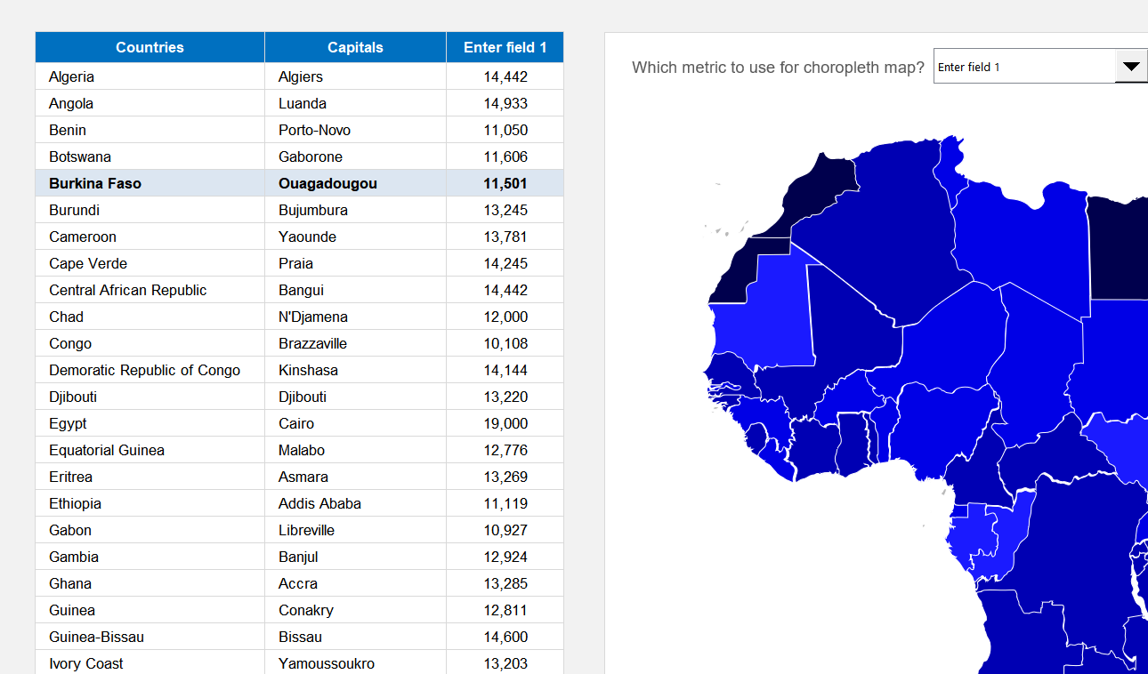
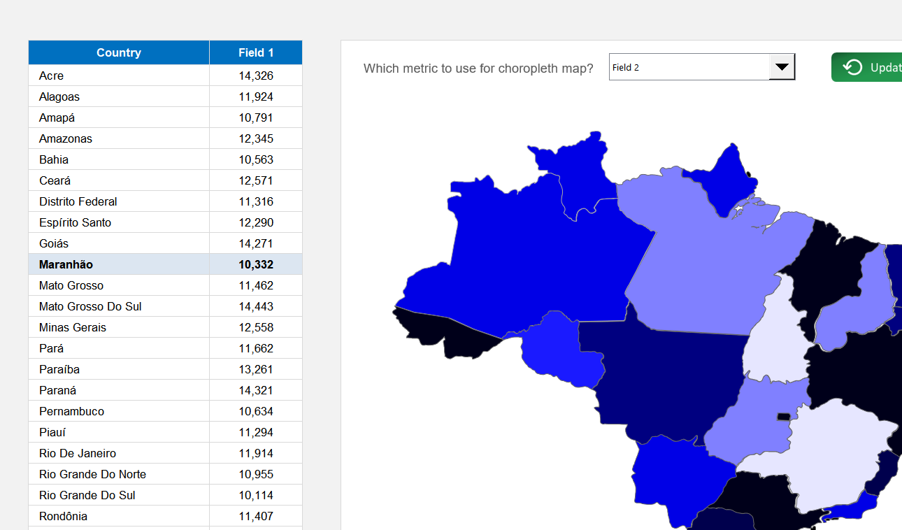
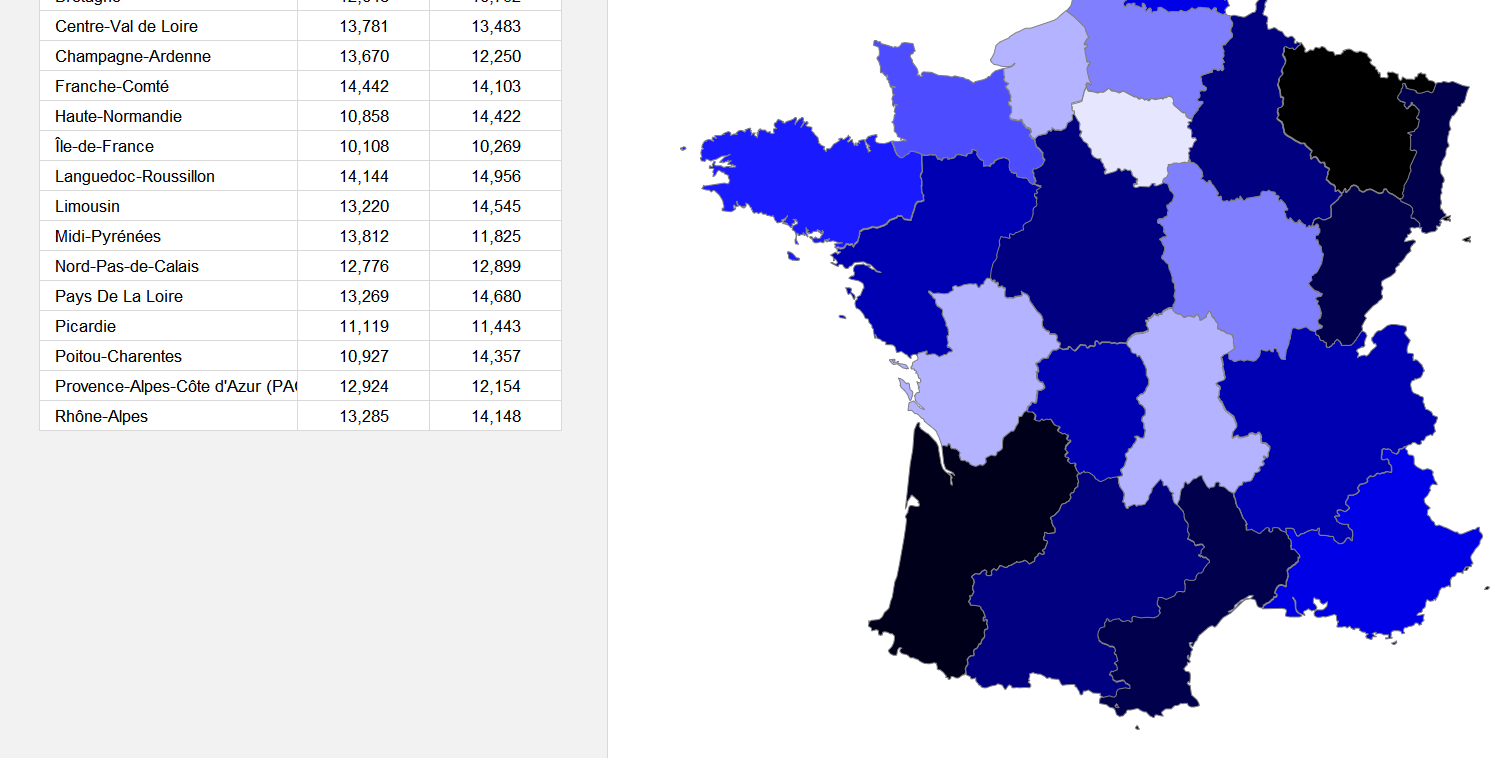
This template creates a choropleth map of France where each region is color-coded based on its value for a specific metric. You can use it to visualize any region-level dataset.
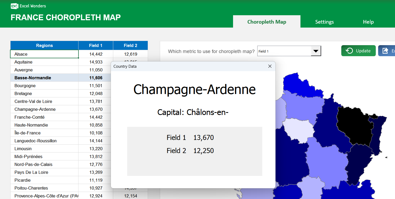
The data table supports up to three data fields per region. Enter your values directly into the table. To customize the field names or to show only one or two fields, go to the "Settings" sheet.
Yes. In the "Settings" sheet, you can set the number format for each data field. Options include absolute number (0 or 1 decimal place) and percentage (0 or 1 decimal place).
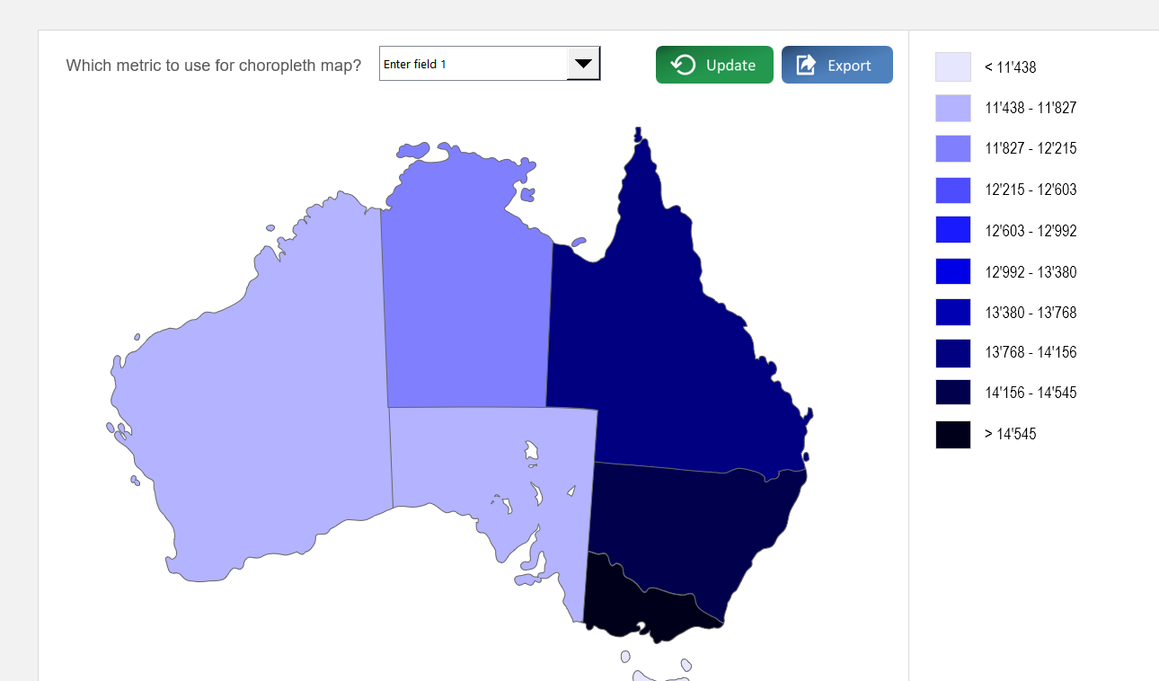
On the "Choropleth Map" sheet, use the dropdown menu located above the map to select which of the three data fields to visualize. The map's colors will update automatically.
Click on any region directly on the map. A pop-up window will appear displaying that region's name, capital (if enabled), and data for all active fields.
Yes. Go to the "Settings" sheet and set the option for capital visibility to "No". This hides the capitals column in the data table and removes them from the region-specific pop-up.
In the "Settings" sheet, you can choose between two methods: Automatic Ranges, where the template divides your data into 10 even ranges, or Manual Ranges, where you define up to 10 custom data ranges.