The Pie Chart Excel Template allows you to create highly customized pie charts, intended to illustrate numerical proportion. In a pie chart, the arc length of each slice is proportional to the quantity it represents and help illustrate their weight on the total sum.
The Pie Chart Excel Template allows you to create highly customized pie charts, intended to illustrate numerical proportion. In a pie chart, the arc length of each slice is proportional to the quantity it represents and help illustrate their weight on the total sum.
Struggling to present data in a clear and visually compelling way? Our Pie Chart Excel Template is the perfect solution, turning raw numbers into professional charts that instantly communicate insights. Create elegant visuals in minutes without complex formatting.
With both static and animated chart options, you can showcase trends over time or deliver a polished snapshot. Simply enter your data into the user-friendly table, hit “Update,” and watch your ideas come to life in vibrant, accurate pie charts.
Designed by Excel specialists with years of experience in data visualization, this template combines intuitive controls with advanced customization options. Whether you’re in business, education, or marketing, your presentations will radiate expertise.
Trusted by hundreds of professionals, our template includes built-in export tools, customizable labels, and animation speed controls, ensuring your charts are presentation-ready for meetings, reports, or classrooms.
Features:
Sorry! No Reviews Yet!
At the moment, we don't have any reviews for the Pie Chart Excel Template.
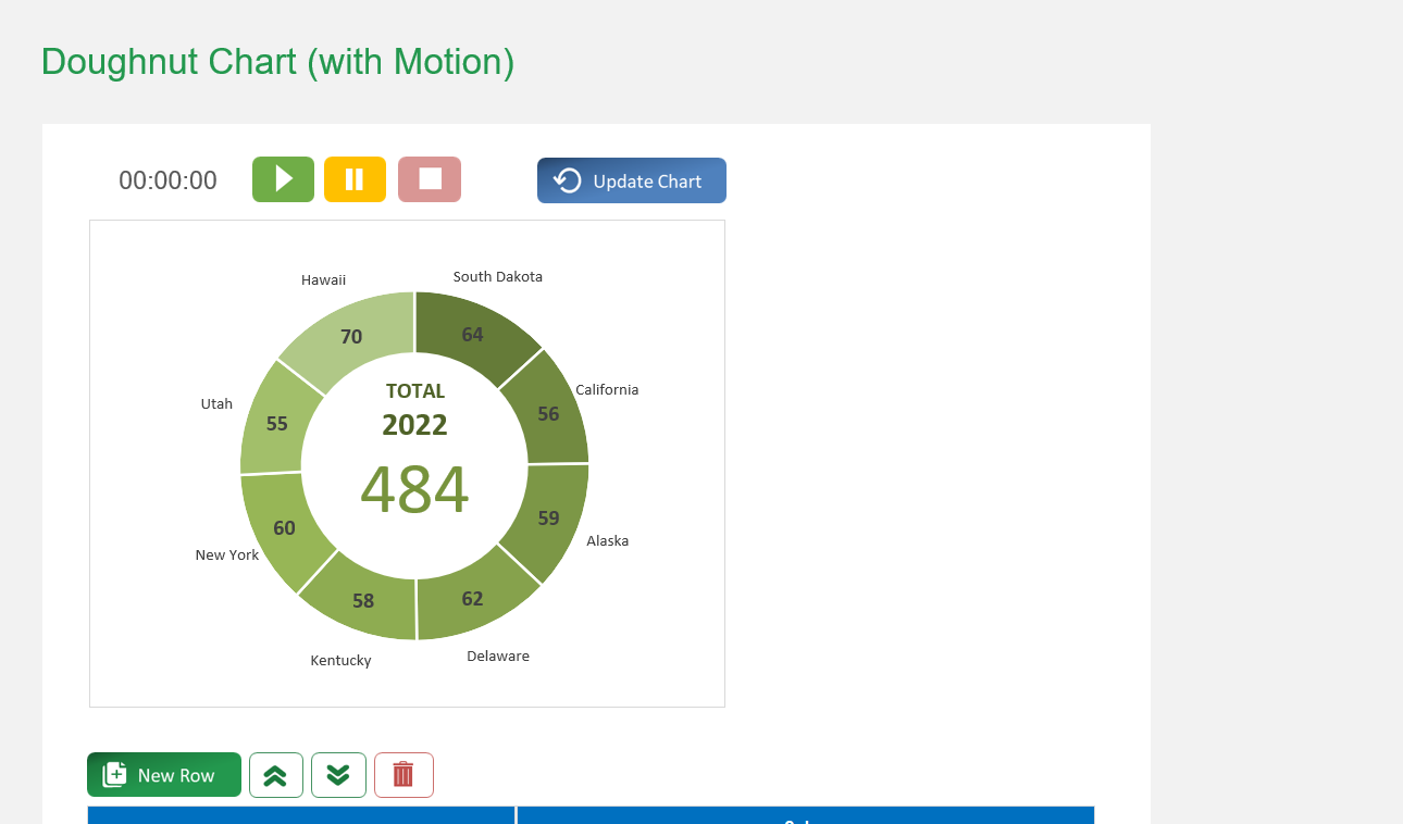
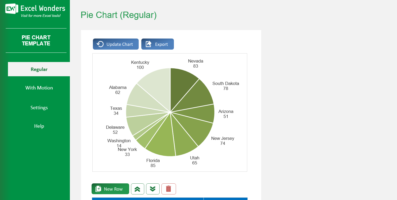
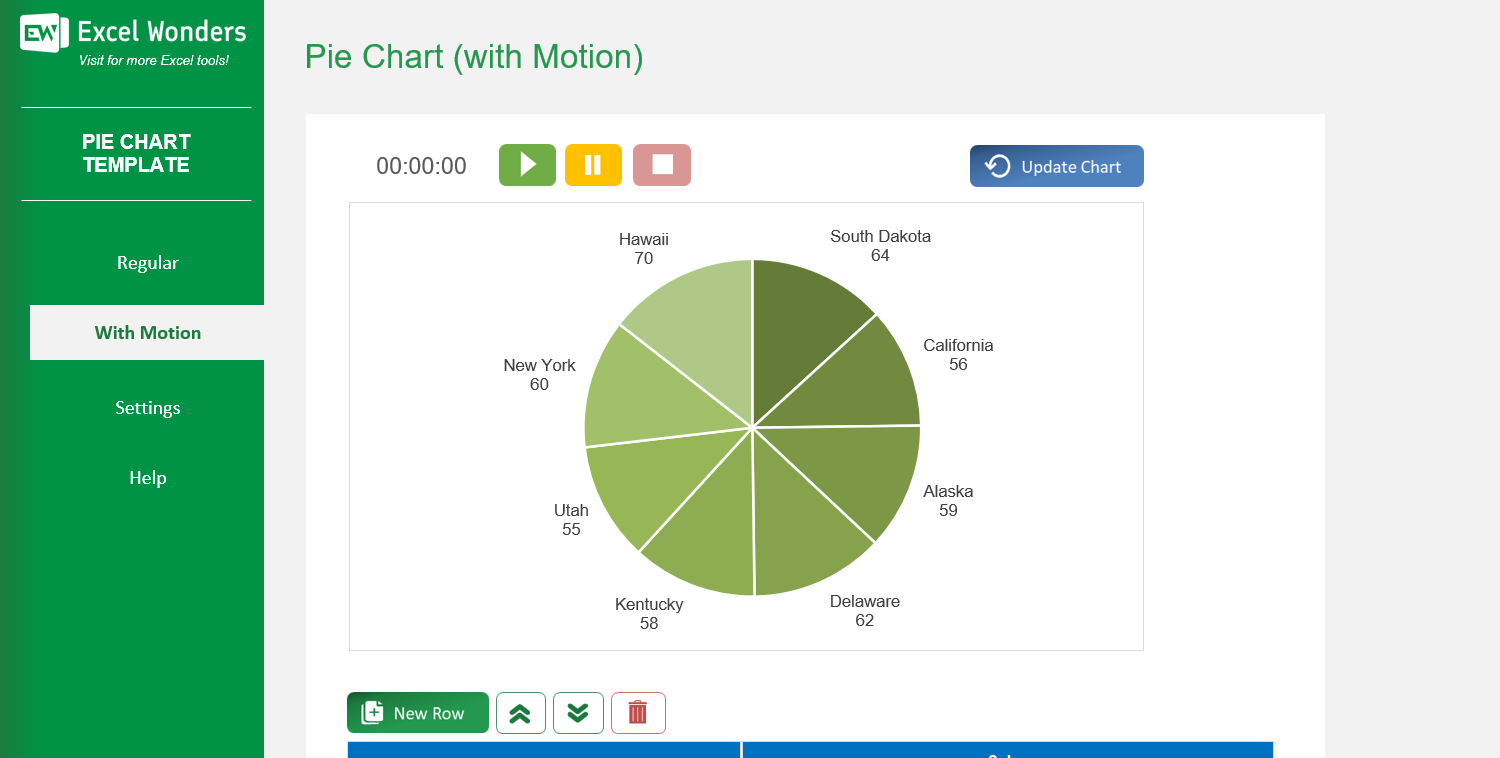
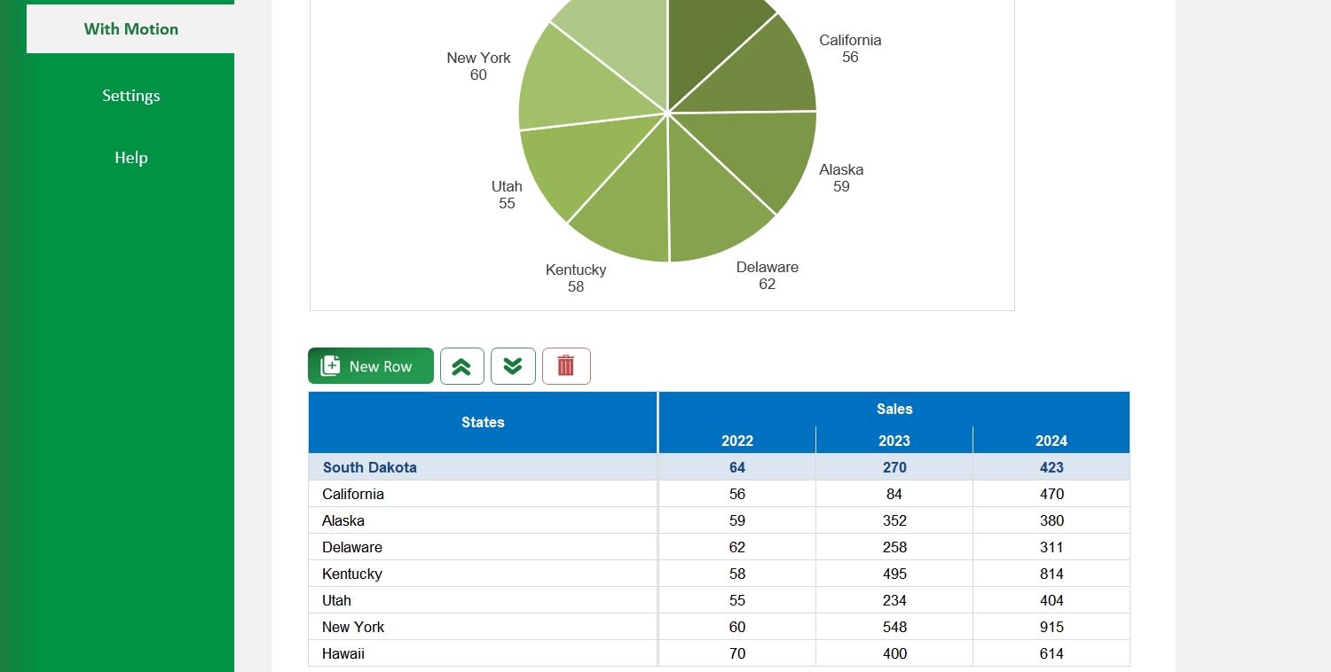
The template offers two types of pie charts: • 'Regular': Creates a standard, static pie chart. • 'With Motion': Creates an animated pie chart that transitions through three distinct time periods or stages.
On the 'Regular' sheet, use the data table located below the chart. You can edit data directly, add a new entry with the 'New' button, delete an entry, or reorder the rows.
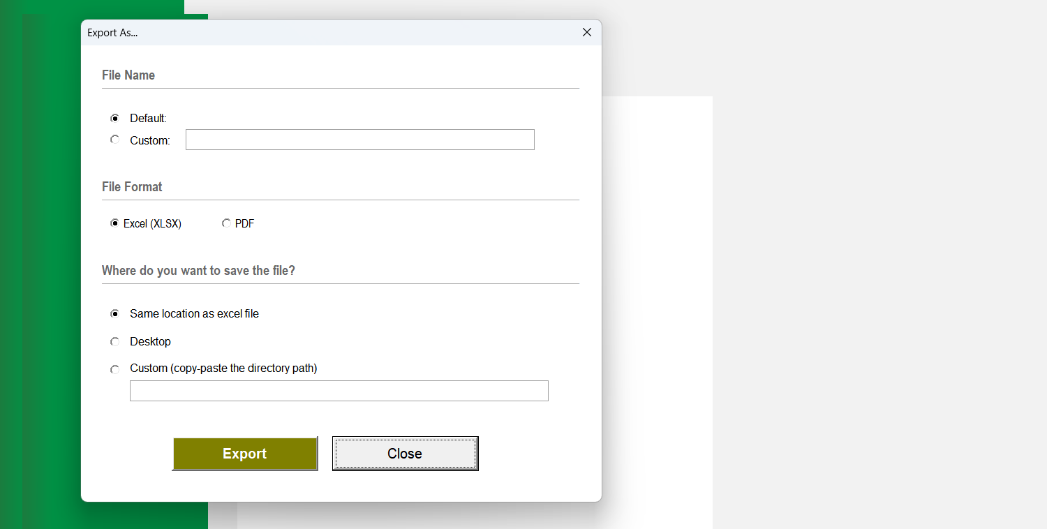
Yes. Click the 'Export' button in the top-right corner. A dialog box will appear where you can set the file name, type, and location to save the chart as a separate file.
If the chart does not refresh automatically after you edit the data table, click the 'Update Chart' button in the top-right corner to apply your changes.
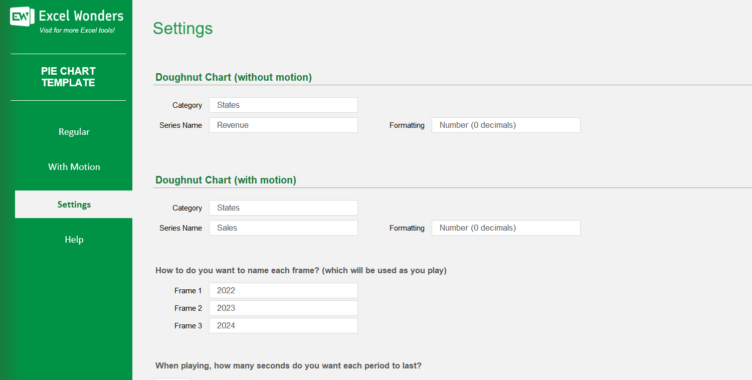
The three data columns represent the different stages or periods for the animated chart (e.g., years, quarters). You can enter the values for each period in these columns and customize their labels in the 'Settings' sheet.
On the 'With Motion' sheet, use the data table located below the chart. You can edit data directly, add a new entry with the 'New' button, delete an entry, or reorder the rows.
Go to the 'Settings' sheet. You will find an option to set the animation pace by entering the number of seconds you want between each period transition.
Yes. You can customize the column headers for the data tables on both the 'Regular' and 'With Motion' sheets by editing them in the designated area on the 'Settings' sheet.