The Scatter Chart Excel Template allows you to create highly customized scatter charts, which help you determine the relationship and/or correlation between variables. You can then easily export the chart for use in any document of your choice.
The Scatter Chart Excel Template allows you to create highly customized scatter charts, which help you determine the relationship and/or correlation between variables. You can then easily export the chart for use in any document of your choice.
If you're struggling to spot correlations or trends in complex datasets, our Scatter Plot Template Excel provides a fast, professional solution. Designed for clear visual insights, it transforms raw numbers into compelling scatter charts you can trust.
Whether you need a standard view or animated transitions, this scatter chart template empowers analysts, researchers, and business users to explore relationships across multiple variables with precision and ease.
Built by Excel experts with years of experience in data visualization, this template ensures accuracy, best-practice chart layouts, and intuitive controls for effortless analysis.
Trusted by professionals worldwide, Excel Wonders delivers tools tested for performance, with responsive support so you can focus on what matters—making better data-driven decisions.
Features:
Sorry! No Reviews Yet!
At the moment, we don't have any reviews for the Scatter Chart Excel Template.
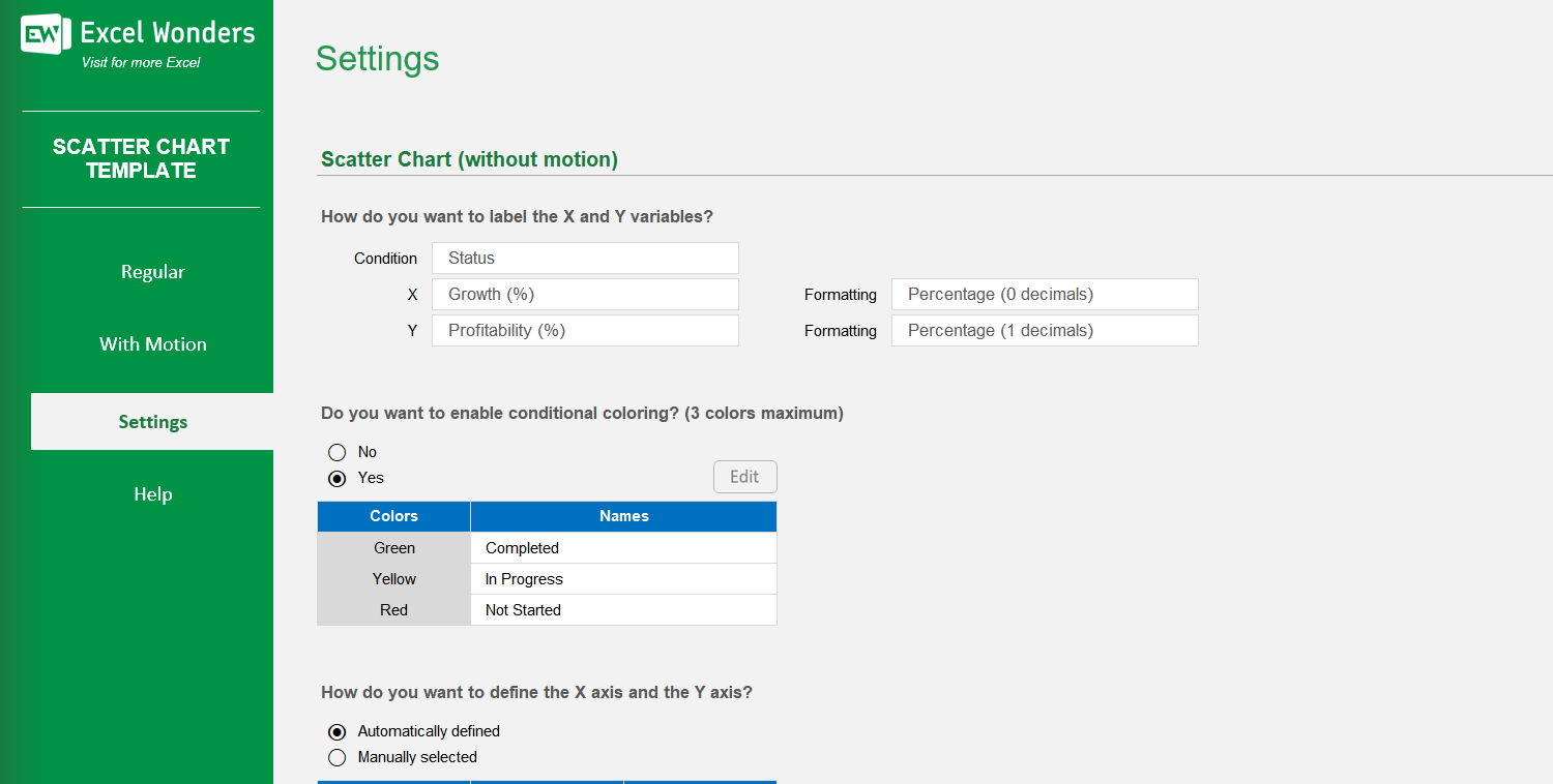
Yes. On the 'Settings' sheet, you can configure the X and Y axes: • Automatic: Excel sets the axis values based on your data. • Manual: You can enter your own custom minimum and maximum values for each axis.
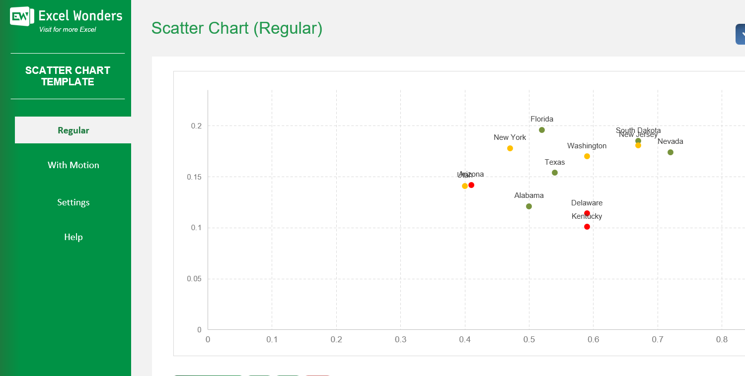
Conditional coloring automatically colors the data markers based on a category. In 'Settings', you can enable this feature and define labels for up to three colors. Markers with a matching label in your data will appear in the assigned color.
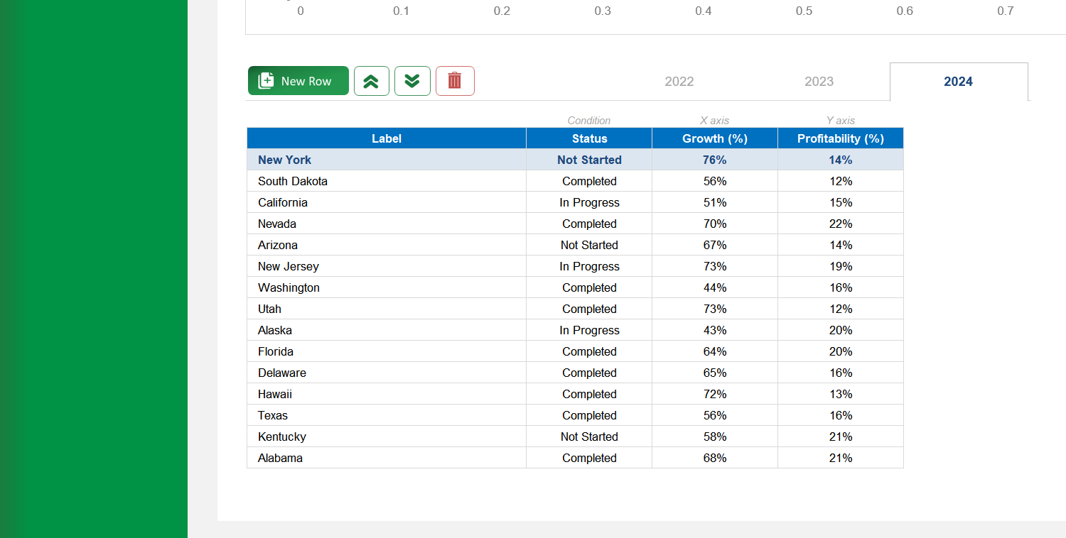
Yes. You can customize the column headers for the data tables on both the 'Regular' and 'With Motion' sheets by editing them in the designated area on the 'Settings' sheet.
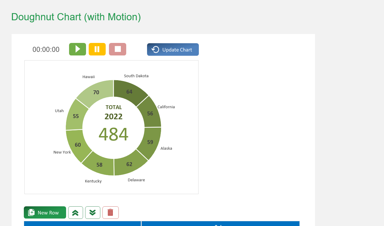
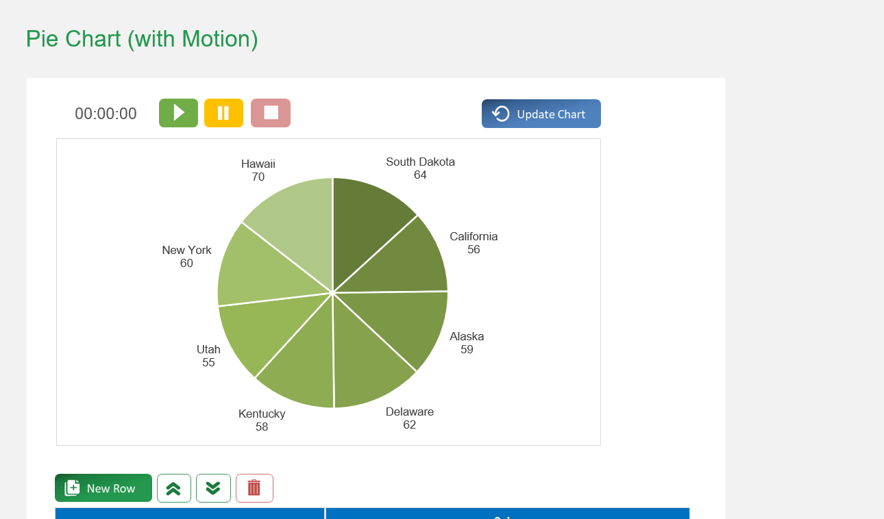
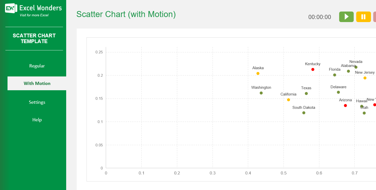
The template offers two types of scatter charts: • 'Regular': Creates a standard, static scatter chart. • 'With Motion': Creates an animated scatter chart that transitions through three distinct time periods or stages.
On the 'Regular' sheet, use the data table located below the chart. You can edit data directly, add a new entry with the 'New' button, delete an entry, or reorder the rows.
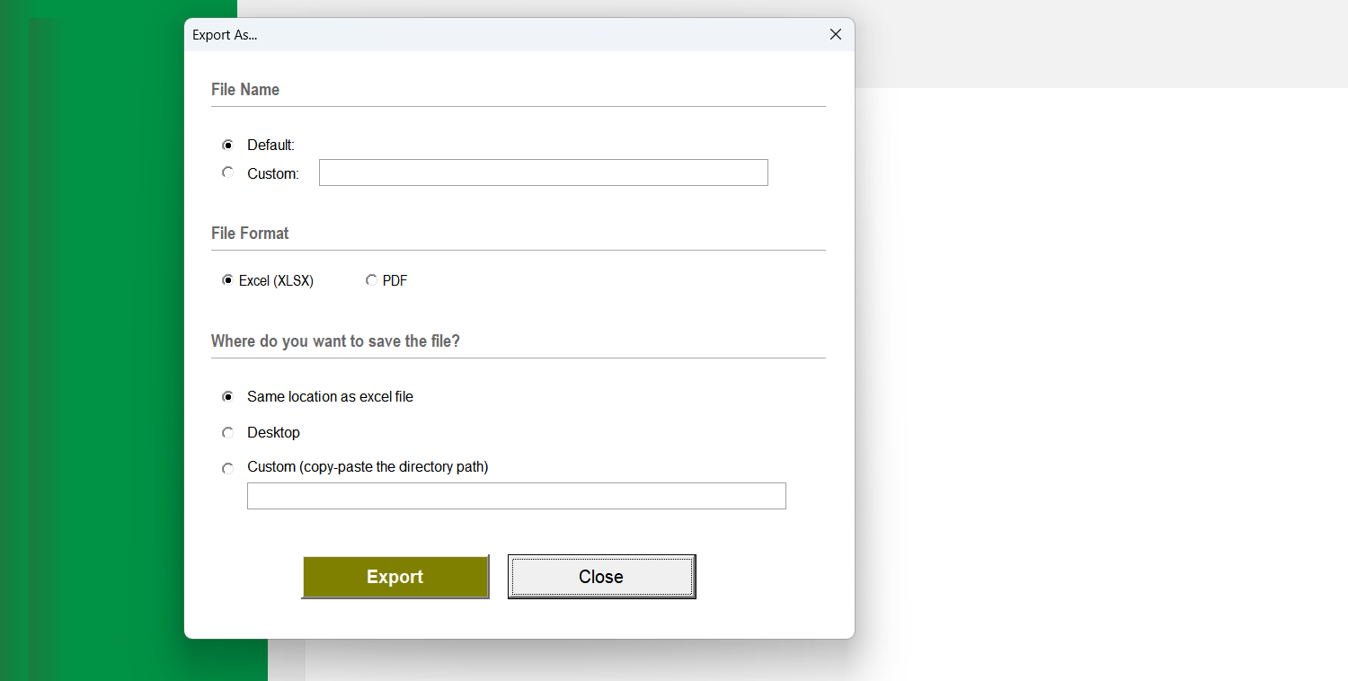
Yes. Click the 'Export' button in the top-right corner. A dialog box will appear where you can set the file name, type, and location to save the chart as a separate file.
If the chart does not refresh automatically after you edit the data table, click the 'Update Chart' button in the top-right corner to apply your changes.
The three tabs above the data table represent the different stages or periods for the animated chart (e.g., years, quarters). Click a tab to view and edit the data for that specific period.
On the 'With Motion' sheet, use the data table below the chart. You can edit data for the selected period, add a new entry with the 'New' button, delete an entry, or reorder the rows.
Go to the 'Settings' sheet. You will find an option to set the animation pace by entering the number of seconds you want between each period transition.