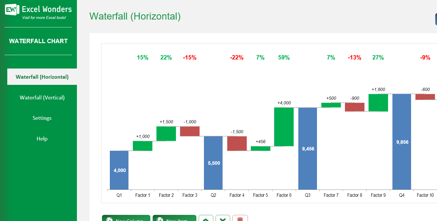
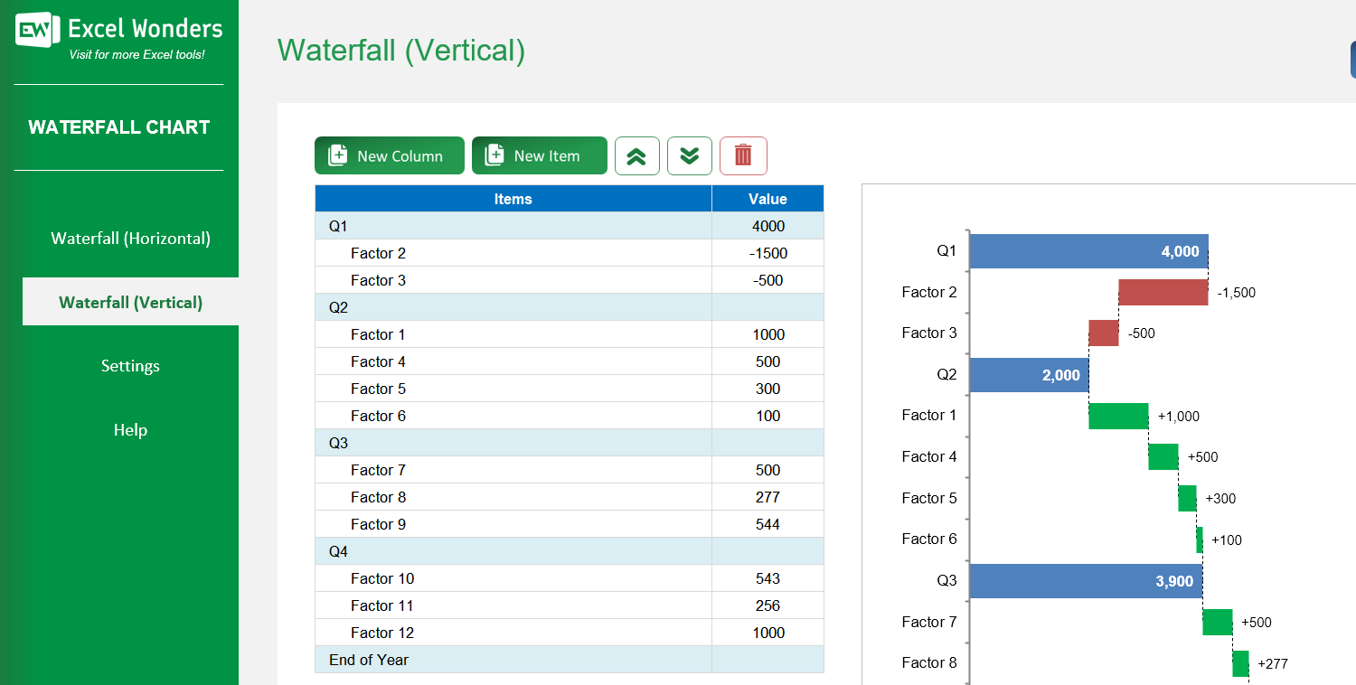

The Waterfall Chart Excel Template allows you to create beautiful horizontal and vertical waterfall charts, to visualize the cumulative effect of each sequentially positioned value. It shows the positive and negative drivers from any given starting point to an end point.
The Waterfall Chart Excel Template allows you to create beautiful horizontal and vertical waterfall charts, to visualize the cumulative effect of each sequentially positioned value. It shows the positive and negative drivers from any given starting point to an end point.
Struggling to present complex data in a clear, impactful way? Our Waterfall Chart Excel Template makes it easy to visualize the cumulative effect of positive and negative changes over time, turning raw numbers into actionable insights.
With customizable horizontal and vertical chart options, you can display data flows in the format that best suits your story—perfect for financial analysis, project tracking, or performance reporting.
Developed by Excel specialists with years of experience, this template includes intuitive controls, automated calculations, and dynamic percentage indicators, ensuring accuracy and clarity in every chart you create.
Join thousands of professionals who trust Excel Wonders templates for their reporting needs—download instantly and start delivering data presentations that impress and drive decisions.
Features:
1 review
1 review
Super useful ! I can create beautiful waterfall charts!
Review for: Waterfall Chart Excel Template
The template provides two orientation options: • Horizontal: Displays the data flow from left to right. • Vertical: Displays the data flow from top to bottom.
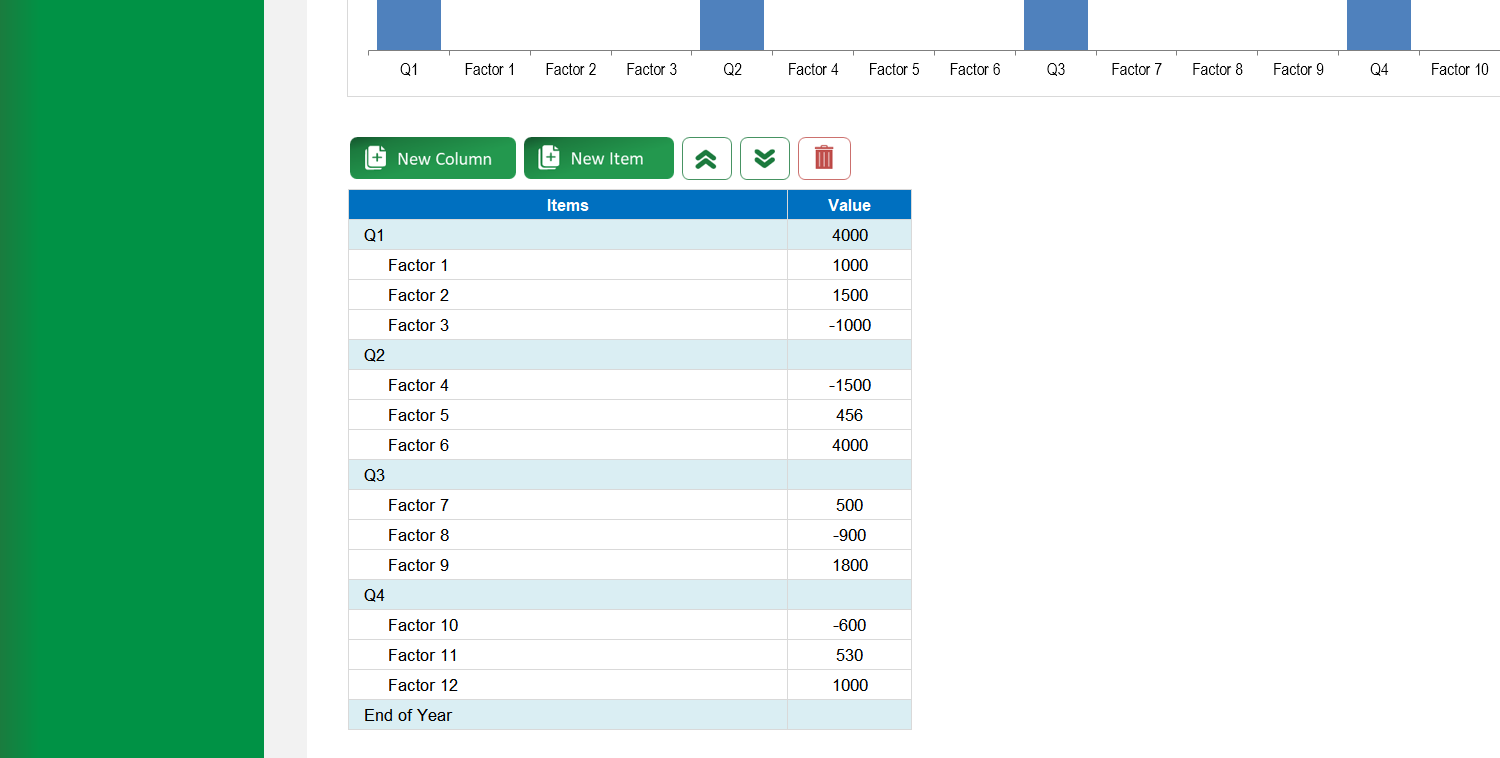
All data is managed in the table next to the chart. This table has two row types: 'Columns' (for totals/milestones) and 'Items' (for positive/negative changes). You can: • Add: Click 'New Column' or 'New Item'. • Edit: Change the label and value for any row directly. • Reorder: Select a row and use the move up/down buttons. • Delete: Select a row and click the delete icon.
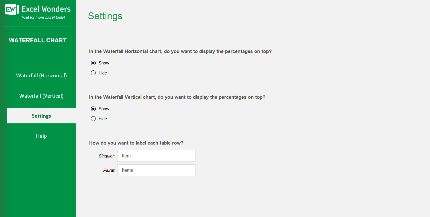
Yes. You can control the visibility of the percentage change indicators on the chart by adjusting the option on the 'Settings' sheet.
Yes. Both chart orientations have an 'Export' button in the top-right corner. Click it to open a dialog where you can set the file name, format, and save location for your exported chart.
A waterfall chart visualizes the cumulative effect of sequential positive and negative values. It shows how an initial value is affected by a series of intermediate changes, leading to a final value.